Stellar — A Design Language For A Cohesive Dev-ops Ecosystem
A new design language that helped multiple product teams work faster and stay consistent. It cut down development time, improved quality, and made collaboration smoother between design and engineering.


Overview
With the rapid expansion of our product suite, maintaining a consistent experience across all products has become increasingly challenging. From release and change management to deployment and, more recently, value stream management, we require a systematic approach to both design and development. This approach needs to enable us to deliver features more quickly, while minimizing design debt and ensuring a cohesive user experience across the entire suite.
By the end of Phase 1, I successfully delivered a comprehensive UI pattern library designed for reuse across the new frontend framework (React). This library includes a collection of modular components that can be assembled to create a wide range of user experiences, from simple interfaces to more complex use cases.
My role
Project Design
Team
1 x product manager
1 x product designer
3 x engineers
Year
2018-2019
[1] Inconsistency issues
[2] Loadtime was bad
Business Goal
Increase app's responsiveness and performance
Reduce support tickets via better on boarding and contextual tutorials
Create delightful customers experience through new design visual design language and consistent experience
Discovery & Definition
After a thorough analysis of Pendo stats, NewRelic data, Zendesk support tickets, and feedback from both stakeholders and customers, it became evident that Plutora required a new design language to ensure the platform was consistent, intuitive, and delightful to use.
Heuristic Evaluation
Based on our heuristic evaluation, we identified three key areas that required urgent improvement:
Consistency and Standardization
Recognition Over Recall
Aesthetic and Minimalist Design
[3] MVP Wireframes
Solutions
A New Front-End Framework
By transitioning from the old front-end to the modern React.js library, we aimed to significantly enhance page loading speed and UI rendering performance. Additionally, React's flexibility and efficiency make it easier to build complex, interactive user interfaces.
A New Design Language
The core solution was to develop a comprehensive design system, rooted in established principles and best practices. Additionally, we ensured that each step was thoroughly documented to maintain consistency and drive efficiency throughout the design process.
Role-based UX
To address complexity, we focused on eliminating unnecessary elements and streamlining the user experience. By tailoring the platform to be persona-specific, we ensured that each user’s interface was optimized for their unique needs and workflows.
Why Stellar?
Remember the movie Interstellar? It’s a masterpiece—but the Stellar Design System draws inspiration from something a bit different. With Stellar, our ambition was to set a new benchmark in the market by delivering a truly 'stellar' experience: fast, intuitive, consistent, and delightful across every touchpoint.
Challenges
Creating a Live Design System
Most of our core applications were built on outdated technology stacks, making it impractical to build a design system on top of the existing interfaces. As the company transitions to more modern, supported stacks, we are committed to evolving our design system in parallel. The result is a dynamic, live design system that updates in real time alongside the current interface, ensuring consistency across platforms and enabling faster iteration.Getting Everyone Onboard
A design system cannot be effectively implemented without buy-in from all functional teams. It’s essential that teams from different disciplines collaborate from the start, sharing their pain points and contributing to solutions. This collaborative approach helps ensure that the design system addresses real challenges and fosters a sense of ownership across the organization.Rolling Out to Customers
Customer feedback made it clear that our clients had been waiting for an enhanced user experience for some time and were eager to try the new design. However, due to the complexity of the legacy systems and their architecture, only select key customers were invited to experience the new design initially. Despite this, it was crucial to keep all clients engaged and excited about the upcoming changes as we gradually expanded the rollout to a broader audience.
Design Principles
Our mission is to help companies become software juggernauts—empowering enterprises to shape the world through exceptional software. With Stellar, we set out to create the most delightful, efficient, and inspiring user experience—one that enables users to build amazing software with confidence, clarity, and joy.
Process
I conducted a comprehensive visual audit across the platform, collaborating with product owners from the Core, API, and Platform teams. Following this, I developed a cohesive visual design language and created a pattern library for all components. I worked closely with developers and product owners to document the purpose and usage guidelines for each component. To ensure consistency across the platform, I also created sets of blueprints (templates) for common page layouts.
[4] One of mapping concept used in usability testing
Visual Audit & Discovery
The initial step involved auditing each area of the product to identify all key visual components. This process included an exploration of primary user flows and use cases. We then categorized the components into groups based on their specific functions. For example, the 'Form' group encompassed elements such as input fields, buttons, selectors, and pickers, while the 'Style' group included components like the color palette, typography, and illustrations.
During this process, several inconsistencies were identified in both the UI and UX areas. These issues were documented and captured for future resolution, with detailed screenshots and entries in a dedicated spreadsheet for tracking.
Define and Create Visual Design Language
We keep our original branding colours and typeface. Then created a palette that we can use in different scenarios which need fresher and lighter colours. I also made a new set of icons to provide modern look of the future UI.
Using Atomic Design Methodology
This system is based largely on the principles of atomic design. The key idea behind this methodology being small, independent - atomic - parts, can be combined into larger molecular structures.
This foundation loosely defined our typography, colors, icons, spacing, navigation and information architecture. and proved essential for guiding our work in a unified direction. Reviewing our collective work at the end of each day, we began to see patterns emerge.
Create UI/Pattern library
The initial step was to audit each area of the product and discover all important visual components. This included exploration of the primary user flows and use cases. Then we categorised them into group elements based on their relevant usages. For instance, form group contains field input, buttons, selectors, pickers and style group could be colour palette, typo and illustrations.
During this procedure, number of inconsistencies found in both UI and UX areas. These issues will be deal with later so I captured anddocumented them carefully with screenshots and spreadsheet.
Document, Experiment & Implementation
While creating these components, we stored them in a sketch file and recreated them with a React component library. We also have a style and component design playground so everyone in the product team and jump and giving feedbacks of new styling and concepts in realtime. Within a month, we already see massive benefits of the design system in terms of productivity. Every page follows a unified
user experience with well defined visual and story. Developers now can assembly a new page within couple hours and pass to others with ready to use shared components.
Design
What would it look like with Stellar? I was asking myself everyday.
Data grid
A new data grid component was introduced and standardized across all entity types—including Releases, Environment Requests, Environments, Deployment Plans, Changes, and Systems.
This new grid addresses several long-standing user frustrations by delivering:
More responsive and intuitive column filters
An improved column selector for easier customization
A cleaner, faster inline popover for viewing additional information

[4] One of mapping concept used in usability testing
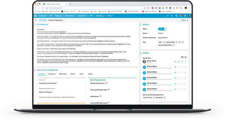
Entity Page
The Entity page was redesigned with a brand-new layout that leverages a full-width page format, replacing the previous modal-based design. Key improvements include:
Grouping information into clearly defined, related sections for improved readability.
Removing all tab-based navigation in favor of a seamless, scrollable layout.
Ensuring each section has a distinct set of functions, while maintaining consistency through shared global controls.
[4] One of mapping concept used in usability testing
Environment Selection
This was one of the most complex pages in the application. Previously, users could only view 2–3 environments at a time, making selection difficult due to a combination of intricate logic and limited display options.
With the introduction of Stellar, the experience was reimagined: environments and environment groups are now listed on one side, while the selection area functions as a dynamic canvas organized by each release’s phases and gates.
This new layout provides users with complete visibility into the booking status of all environments, significantly improving usability and decision-making.

[4] One of mapping concept used in usability testing
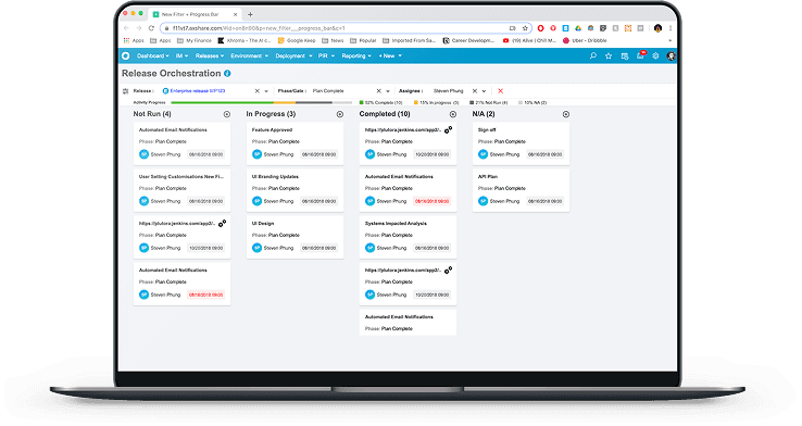
Kanban
The Release Activity Board allows users to update statuses or trigger automated release activities remotely.
With Stellar, the experience was significantly enhanced—users can now easily create new activities and manage the release process from a single, unified view, eliminating the need to switch between different screens
[4] One of mapping concept used in usability testing
Audit History
The previous full-page modal for user activity was replaced with a lightweight side panel, streamlining the experience without disrupting context.
The redesign introduced two key enhancements:
A new color-coded system to clearly indicate updated and edited records
A powerful, role-based search feature to deliver more relevant and secure results based on user permissions

[4] One of mapping concept used in usability testing
Testing & Feedbacks
User testing was initiated early in the discovery phase to uncover major pain points in the existing system. Throughout the redesign process, testing was conducted at every key milestone. Interactive prototypes were shared with stakeholders regularly to gather early feedback and validate design decisions. Following multiple surveys and user pilot sessions, we successfully launched the first redesigned System Module to all customers, with ongoing iterations applied to the remaining parts of the application.
Impact
Countless hours of conceptualisation, planning, sketching, and building went into achieving the outcomes we envisioned for the Plutora platform. We were incredibly proud to introduce the new essence of the product through the Stellar experience. The result is a light, fast, and minimalistic design system that delivers a delightful, user-centric experience—empowering our customers to accomplish their daily tasks with greater ease, efficiency, and satisfaction
Learnings
1. Planning is Crucial
This was a large-scale project that impacted nearly every area of the product. Inadequate planning or underestimation could have led to major disruptions across teams. By carefully structuring a realistic roadmap and identifying phased steps, we successfully avoided the risk of widespread rollbacks and ensured smoother execution.
2. Teamwork is Dreamwork
Cross-functional collaboration proved to be invaluable. Involving more team members early brought diverse perspectives, uncovered potential roadblocks sooner, and accelerated problem-solving. The more eyes on the work, the better the outcomes.
3. Early Reviews Are Essential
Sharing early concepts—even rough ones—saved significant time and effort. Early feedback helped us avoid redundant work, identify misalignments, and focus on problems that truly mattered. It’s far more efficient to course-correct early than to fix missteps later in the process.