Case study
Cleaning on the go
In response to growing demand, HomeHello expanded its operations to major cities such as Melbourne and Brisbane. To support this geographic growth and enhance service delivery, the company planned a major platform update—introducing two brand new mobile applications: one tailored for clients, and another designed specifically for service partners. These apps aimed to streamline communication, improve booking efficiency, and elevate the overall user experience across all touchpoints.
To comply with my NDA, I have omitted confidential information. These designs are a reinterpretation of the finals.
My role
As a member of the Agile team, I was responsible for shaping the experience strategy and crafting the visual design for two cross-platform mobile applications. Between September and December 2015, I led the end-to-end UX efforts—developing key deliverables such as user flows, wireframes, and high-fidelity mockups—and regularly presented these to product managers for feedback and alignment.
Role: UX/UI Designer
Project Duration: 6 weeks
Tools Used: AxureRP, Sketch
The vision
As we envisioned the future of the HomeHello mobile app, we saw an opportunity to go beyond simply replicating the web experience. We imagined a seamless, intelligent system that synchronized information effortlessly between clients, admin, and cleaners.
Picture this: A client books a cleaning session through the app, selecting a preferred cleaner named Emma. Instantly, the cleaner receives a notification saying, "Emma booked you on 12th Dec 2015." The cleaner opens her app, reviews the booking details, and confirms the job with a single tap.
On the day of the appointment, Emma encounters a delay due to parking difficulties. Rather than making a call or sending a manual message, she opens the app and selects a pre-defined message: "Sorry, I will be late for 10 minutes." The client receives the update instantly, staying informed and reassured.
On arrival, Emma uses a "Check-in" feature to notify both the client and admin that she has reached the location. After completing the job, she taps "Check-out" before leaving. While heading home, she receives a smart notification: there's another job available within 3 km. Curious, she checks the job specs, finds it suitable, and heads over. No manual coordination required.
The entire workflow—from booking to job assignment and real-time updates—is seamless and automated. The admin remains in the loop without having to manage any manual tasks. This future-forward scenario was not just about convenience—it was about trust, transparency, and real-time communication. It inspired our design direction and guided our vision for a mobile-first, human-centered product.

A "very" lean UX approach
Working as the sole designer on a small team with tight timelines, I didn’t have the capacity to conduct formal user research. Instead, I focused on practical approaches that could yield fast, actionable insights.
Lean UX process

To understand user expectations and pain points, I:
Studied competitors' mobile apps to benchmark design patterns, user flows, and key features
Reviewed app store reviews and user feedback from similar services to identify common complaints and wishes
Referenced internal feedback from customer support and sales team notes
Conducted informal conversations with a few friends and family members who matched the target audience
Commpetitive analysis

Key Takeaways:
A smooth and quick booking process was crucial for users with busy schedules
Clarity on what was included in the cleaning service helped reduce hesitation
Visual trust elements like cleaner profiles and ratings were expected, especially by first-time users
These insights helped guide my design priorities and ensured the final prototype addressed real-world user needs within our constraints.
Ideation + Design
Given the lean nature of our team, I worked closely with the founders to conceptualise the app experience from the ground up. We held rapid brainstorming sessions and whiteboard workshops to align on key objectives and user journeys.
UX flows
To guide the structure of the mobile app, I developed user flows that helped clarify key interactions and ensured a seamless experience from entry to conversion. These flows also served as a reference for wireframing and stakeholder discussions.
Cient booking app's primary user flows
Booking a Cleaning Service: Home Screen → Select Service Type → Choose Date & Time → Enter Address → Confirm Booking
Viewing Cleaner Profiles: Home Screen → Browse Cleaners → View Profile → Read Reviews & Ratings → Select Cleaner
Account Setup & Preferences: Welcome Screen → Sign Up / Log In → Set Preferences (Home size, Frequency) → Save Settings
Support & FAQs: Receive Notifications → Booking Confirmed / Cleaner En Route / Job Started / Job Completed
Rate & Review: Post-Job Notification → Rate Cleaner → Leave Optional Review
Support & Help: Menu → Help Center / FAQs → Contact Support
Service partner app's primary user flows
Onboarding & Profile Setup: Welcome Screen → Sign Up / Log In → Upload ID & Certifications → Add Availability → App Dashboard
Accept & Manage Jobs: Notification Received → View Job Details → Accept / Decline → Job Added to Schedule
Job Execution Workflow: Job Scheduled → Navigate to Client’s Address → Use “Check-in” → Perform Job → Use “Check-out” → Job Marked Complete
Communicate with Client/Admin: Job Screen → Pre-defined Messages (e.g., “Running Late,” “Arrived”) → Send Notification
Job History & Earnings: Dashboard → View Job History → View Weekly Earnings → Download Payment Summary
Live Job Notifications: Post-Job Notification → “New Job Available Nearby” → View Details → Accept / Decline
Support; Menu → Report an Issue → Contact Admin Support
These user flows helped ensure that the app’s navigation was intuitive and aligned with user expectations. I worked on mid-fidelity wireframes in AxureRP and gradually progressed to high-fidelity mockups in Sketch. My focus was the booking flow and cleaner profile UI.
Wireframes
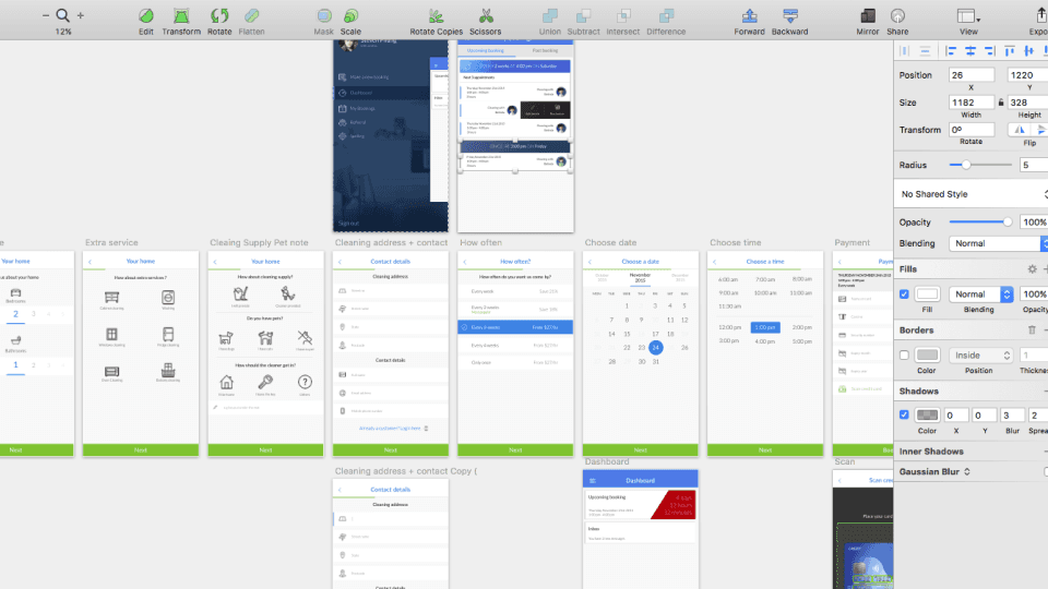
Once the core user flows were defined, I translated them into mid-fidelity wireframes using AxureRP. These wireframes laid out the structure and flow of each key screen, allowing the team to visualize the user journey and validate functionality early. They also served as blueprints during stakeholder reviews and handoffs to developers.
Initial UX flow of client mobile app

Prototyping
-
Initial UX flow of client mobile app
Visual Design
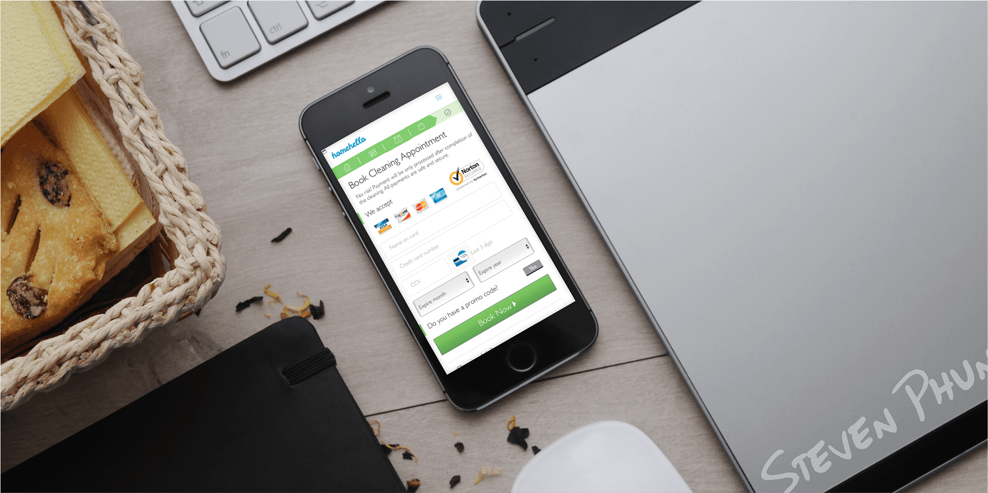
With the wireframes approved, I transitioned to high-fidelity visual design using Sketch. My goal was to establish a user-friendly and polished interface that felt both professional and inviting. I applied a minimal, clean aesthetic aligned with HomeHello’s brand, ensuring that icons, colors, and typography reinforced clarity and trust.
Emphasis was placed on accessibility, with thoughtful contrast, legible text, and intuitive controls across both iOS and Android platforms. I worked on mid-fidelity wireframes in AxureRP and gradually progressed to high-fidelity mockups in Sketch. My focus was the booking flow and cleaner profile UI.
Hifi Design on Sketch
HomeHello App
A better way to clean your home.
Book, manage, review your cleanings.
Refer your friend, get $25 each for each successful invite.


HH Partner App
Meet your new organiser.
Track your booking, claim open jobs.
Review rating, improve and get rise.


Outcome & Learnings
As I transitioned to a new opportunity shortly after the design phase concluded, I did not see the final launch of the HomeHello mobile app. However, I was able to complete and hand off a fully tested, high-fidelity prototype along with detailed design specifications and annotations to the development team.
What I Learned:
Designing for mobile-first required me to simplify and prioritize user needs more intentionally
Trust-building elements such as cleaner reviews and service transparency are essential in service marketplaces
Collaborating closely with product managers and engineers helped ensure the designs were both user-friendly and feasible to build
Reflection
This project marked an important milestone in my early design career. It strengthened my end-to-end UX/UI skills and deepened my understanding of translating business goals into practical, user-centric design solutions.